Website design is a strategic tool that directly influences user experience, brand credibility, and business results. Still, many projects fail by repeating basic mistakes. Here are the most common ones — and how to avoid them.
1. Disorganized layout and lack of visual hierarchy
A site without clear structure confuses the user and scatters attention.
How to avoid:
- Use consistent grids and balanced spacing.
- Define a clear typographic hierarchy (headings, subheadings, body).
- Apply sufficient contrast between elements.
2. Hard-to-read typography
Overly decorative fonts, inconsistent sizes, or weak contrast harm readability.
How to avoid:
- Choose clean, professional fonts.
- Keep a minimum size of 16px for body text.
- Ensure at least WCAG AA contrast between text and background.
3. Lack of responsiveness
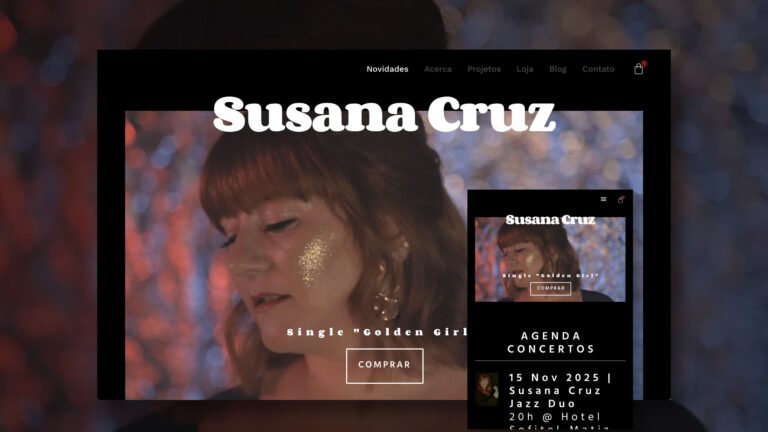
A site that doesn’t adapt to mobile devices loses traffic and credibility.
How to avoid:
- Use media queries and relative units (
em,%,vw). - Test across multiple screen sizes.
- Avoid fixed or overlapping elements on mobile.
4. Heavy and poorly optimized images
Large, uncompressed images slow down loading speed and hurt SEO.
How to avoid:
- Use modern formats like WebP.
- Compress images without losing quality.
- Set specific dimensions (
width,height) to prevent layout shift.
5. Confusing or hidden navigation
Menus that are unclear or poorly placed make site exploration difficult.
How to avoid:
- Keep the menu visible and accessible on all pages.
- Use clear and consistent labels.
- Avoid excessive submenus or slow animations.
6. Ignoring accessibility
Sites that neglect accessibility best practices exclude users and may violate legal standards.
How to avoid:
- Use
altattributes on all images. - Ensure keyboard navigation is possible.
- Apply contrast, visible focus, and semantic structure (
<main>,<nav>,<article>).


